
Hmmm… not that high, IMHO.
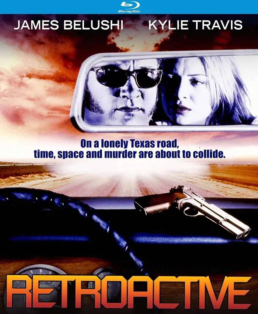
Jim pursing his lips in the mirror while previewing an eventually-rejected look for Blues Brothers 2000. (“We’re 106 miles to Amarillo. We’ve got a time machine, a six-pack of Australian lager, it’s bright and I’m wearing sunglasses… Hit it.”)
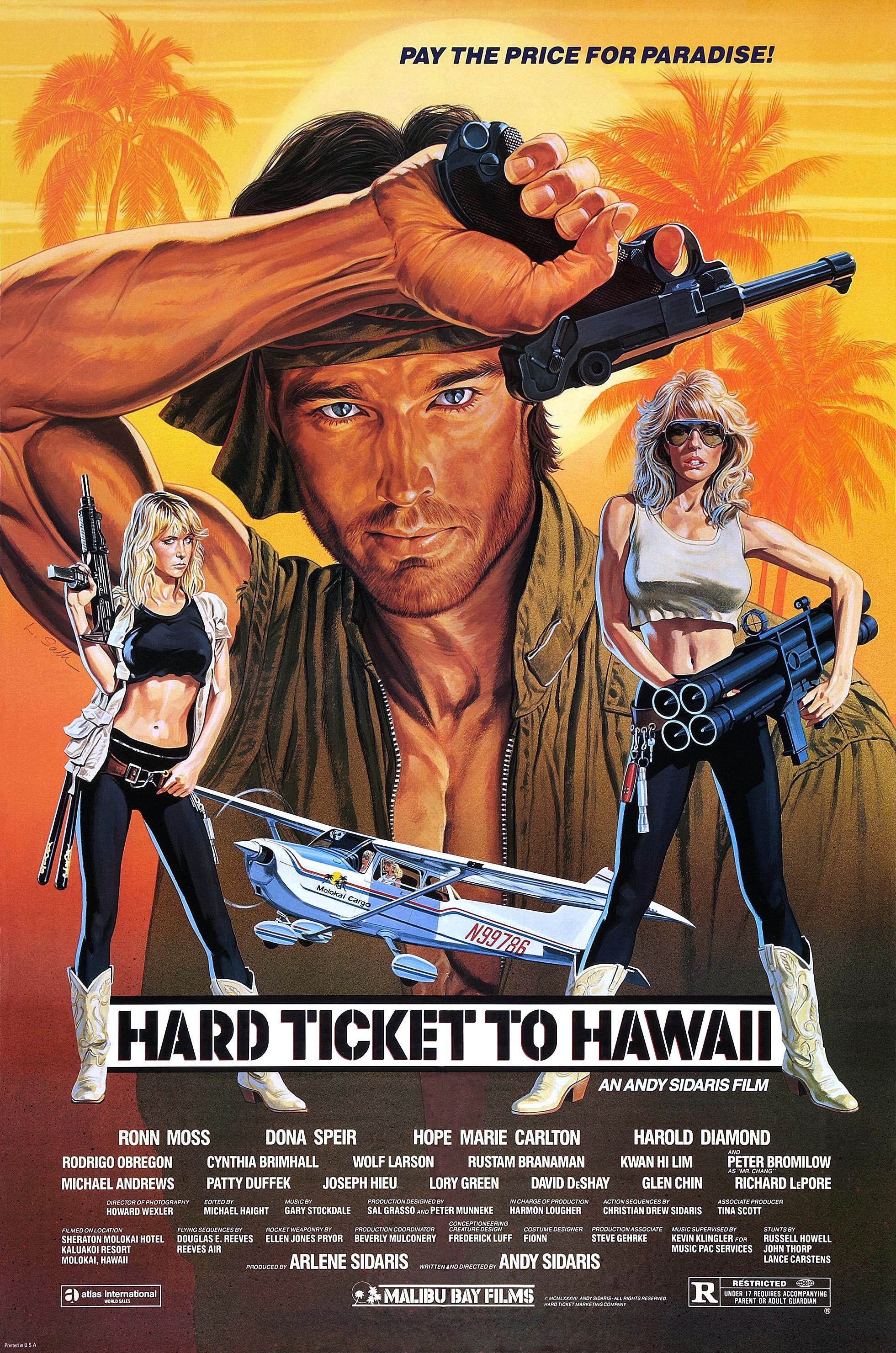
Yes, there’s a gun but its presence is so feeble: that thing will obviously slide off the dashboard the moment there’s any action, and the goodie and the baddie will have to spend the next three minutes cracking their heads together while rummaging under the seats through dropped change, old fast food wrappers and a highway map of Oklahoma from 1982 before they find the damned thing!
There were other posters/covers I saw that were more actiony: explosions, lightning bolts, a gun actually being held and used. And in a tribute to Basil Exposition, clocks. “You know, cuz it’s timey-wimey.”
Of those alternates, I’d pick #2 as top for a combo of stylistic and actiony reasons.
#1 has a consistent and menacing look and colour scheme, but a distinct lack of shooty or blow-uppy stuff.
#3 has got two guns in use and the cheesy-but-beloved classic of a background explosion, but seems like two posters mashed together; I’d have gone with the top half.
#4 has got action appeal and the visual consistency #3 lacks, but features (now I’ve seen the film) a very minor character.
I really have no idea WTF is going on in the middle of #5, and they seem to have just picked some stock photo of a random model driving a random model of car, not the vintage Caddy featured in the film.
#6 has lightning! And more lightning! And Xzibit saying “Yo dawg, I heard you like lightning so I put lightning in your lightning!” And multiple fires and multiple guns. My choice if I was going for maximum straight-to-video action cheesiness.
But I went with the one in OP because:
- it seemed to be the predominant design
- a high resolution version was available
- it’s in English :)


A DEI hire? Oh, wait…